Unlimited Digital Access / Get £25 off your Annual Digital Subscription! Use code 25OFF
GET STARTEDMore on KentOnline
Unlimited Digital Access / Get £25 off your Annual Digital Subscription! Use code 25OFF
GET STARTEDMore on KentOnline

Kent County Council replaced its logo, left, with a new design costing £2,000
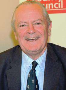
by political editor Paul Francis
It is so subtle you might not have noticed. But Kent County Council has changed its corporate logo - and says the switch has cost the taxpayer a modest £2,000.
At a time when large organisations are increasingly aware of their corporate image, the redesign might be regarded as restrained rather than radical.
In fact, some have questioned whether there is much of a difference at all.
It still boasts the historic Invicta horse, which will be a relief to traditionalists.
But the typeface - a more modernistic angular black font set on a white background - has replaced the previous white font that was slightly wider and set against a red background.
In a statement, the county council said: "The decision to change the logo was taken by the council's corporate management board last year. It cost £2,080 to design."
Cllr Mike Hill (Con), cabinet member for customer and communities, said: "In order to achieve our major savings targets, one of the council's key strategies is to move more customer activity online - such as giving people the ability to book a school place or renew a library book via our website - which in turns encourages people to self serve and reduces calls to our contact centre, therefore allowing us to reduce our costs to taxpayers."
He added: "A key part of this is raising the prominence of the website address and including it in the logo, which goes onto thousands of public information materials every year, was an obvious and low cost way of encouraging people to access services online."
Perhaps conscious that additional costs associated with the change might not go down well with taxpayers, the council is gradually phasing in the logo, meaning residents will, possibly confusingly, be seeing two logos for a while.

Cllr Hill said: "We're aware that changing every sign and item carrying the logo would be too expensive and so we will simply be replacing them as and when they are needed."
Oppostion parties have questioned the need for a change.
Labour group leader Cllr Gordon Cowans said: "I think people do mind about this sort of thing, when families are counting every penny and will ask why on earth the council is wasting money on something like this.
"Quite frankly, the old logo was just as readable and stood out. Whether it is a small or large sum of money, every single penny spent on something like this is money not being spent on frontline services."